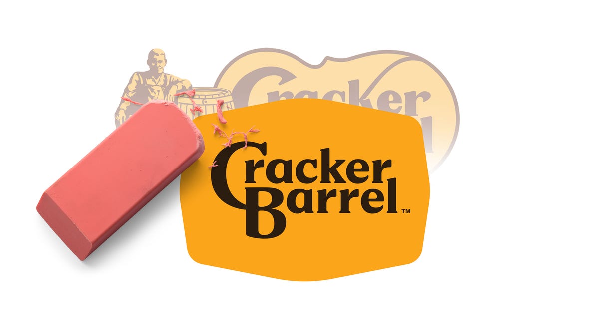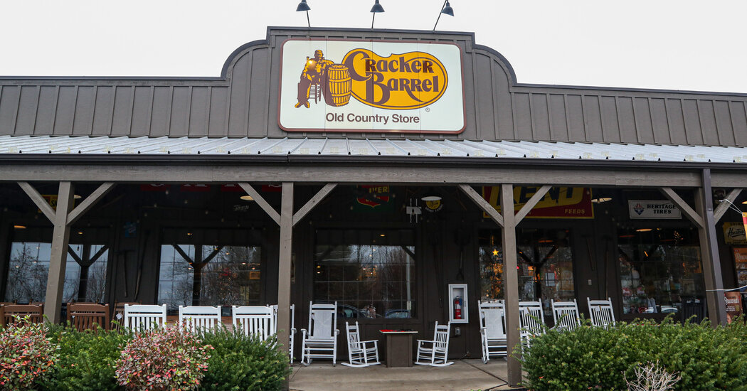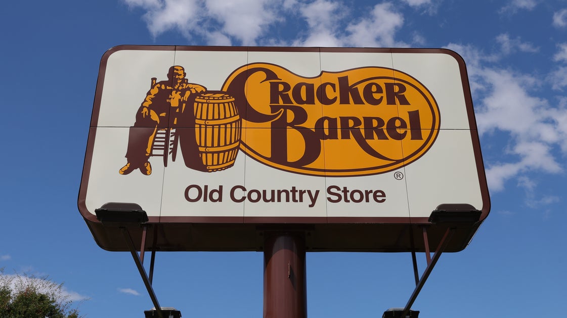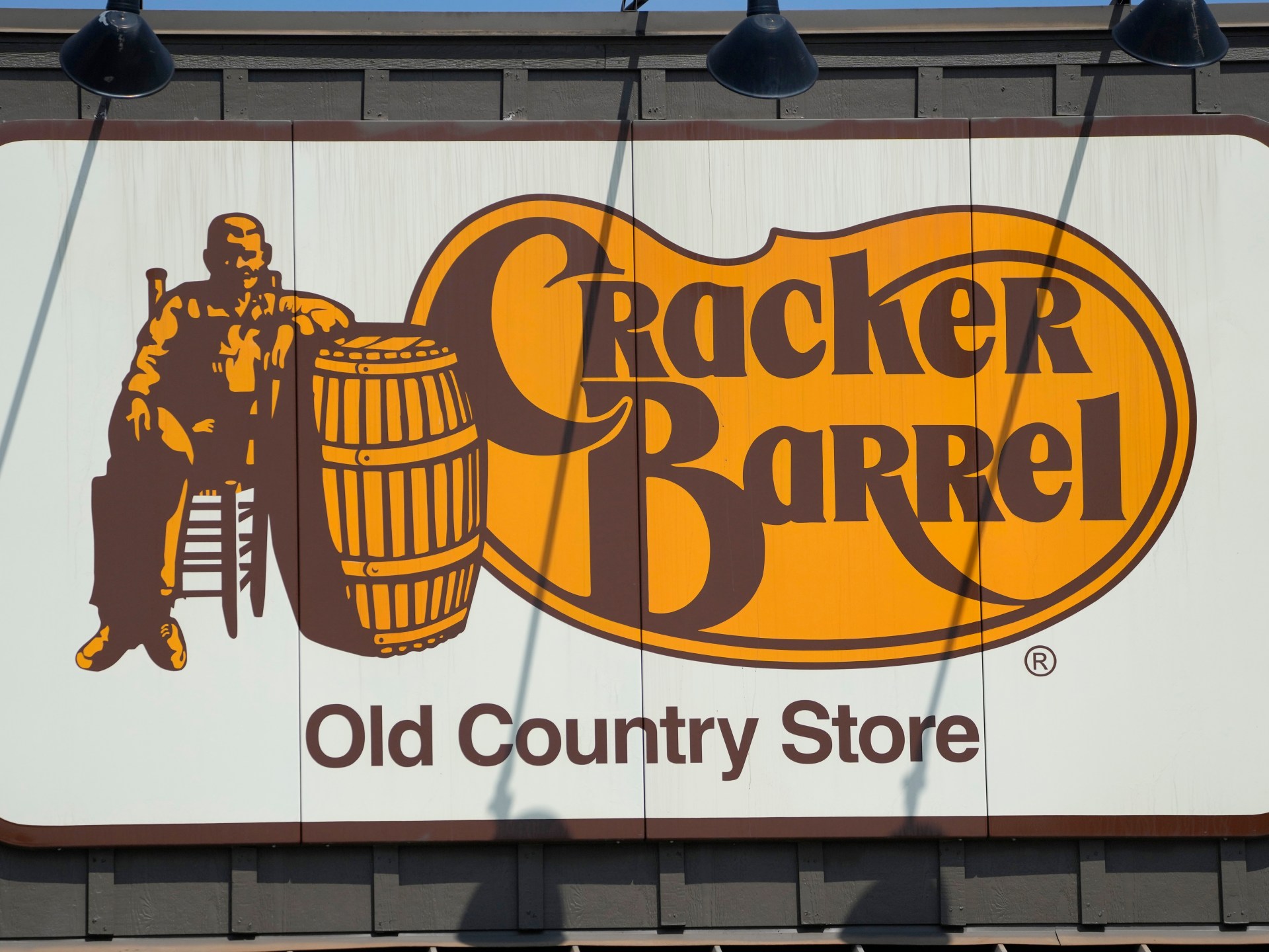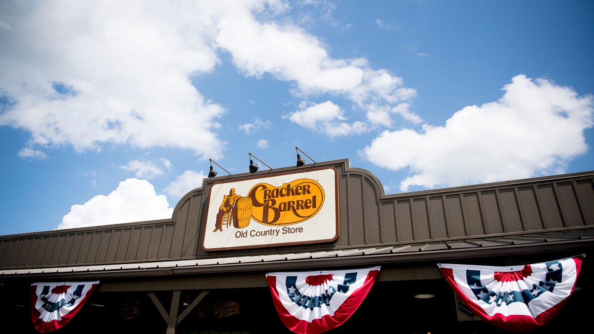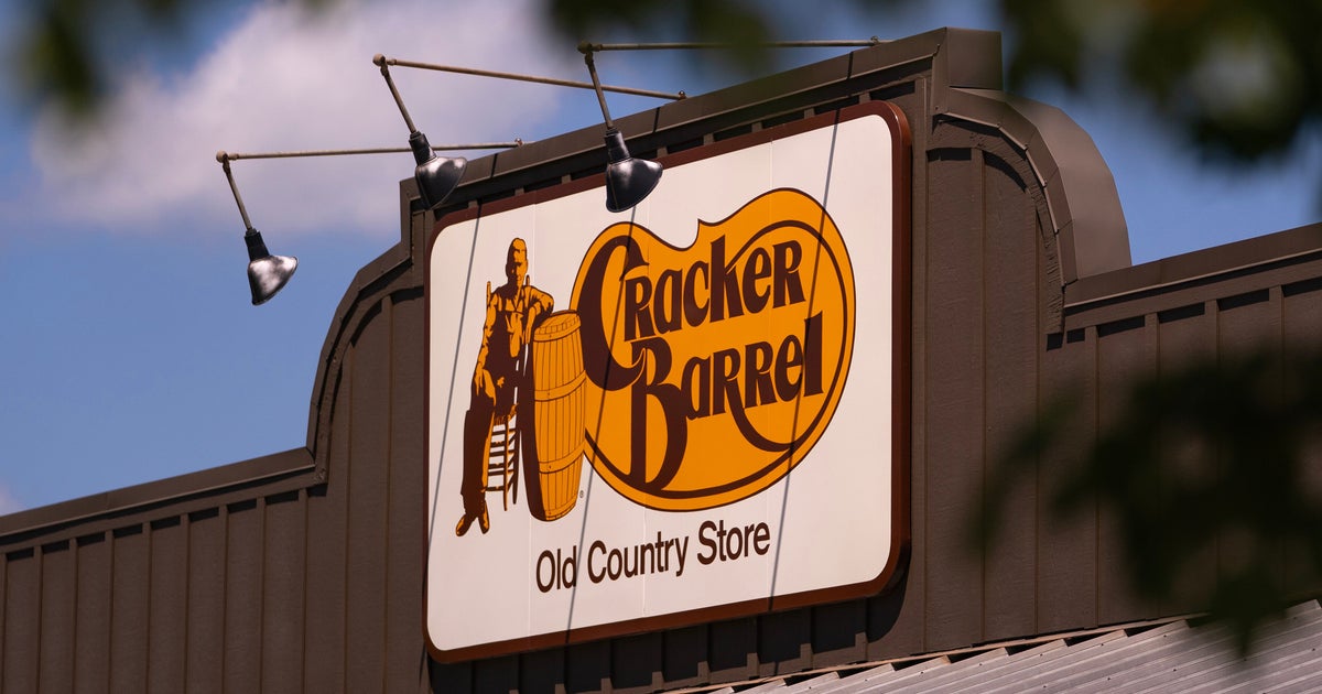
Cracker Barrel, the southern-style restaurant chain, is facing right-wing backlash after removing the seated man and the barrel from its logo after 48 years.
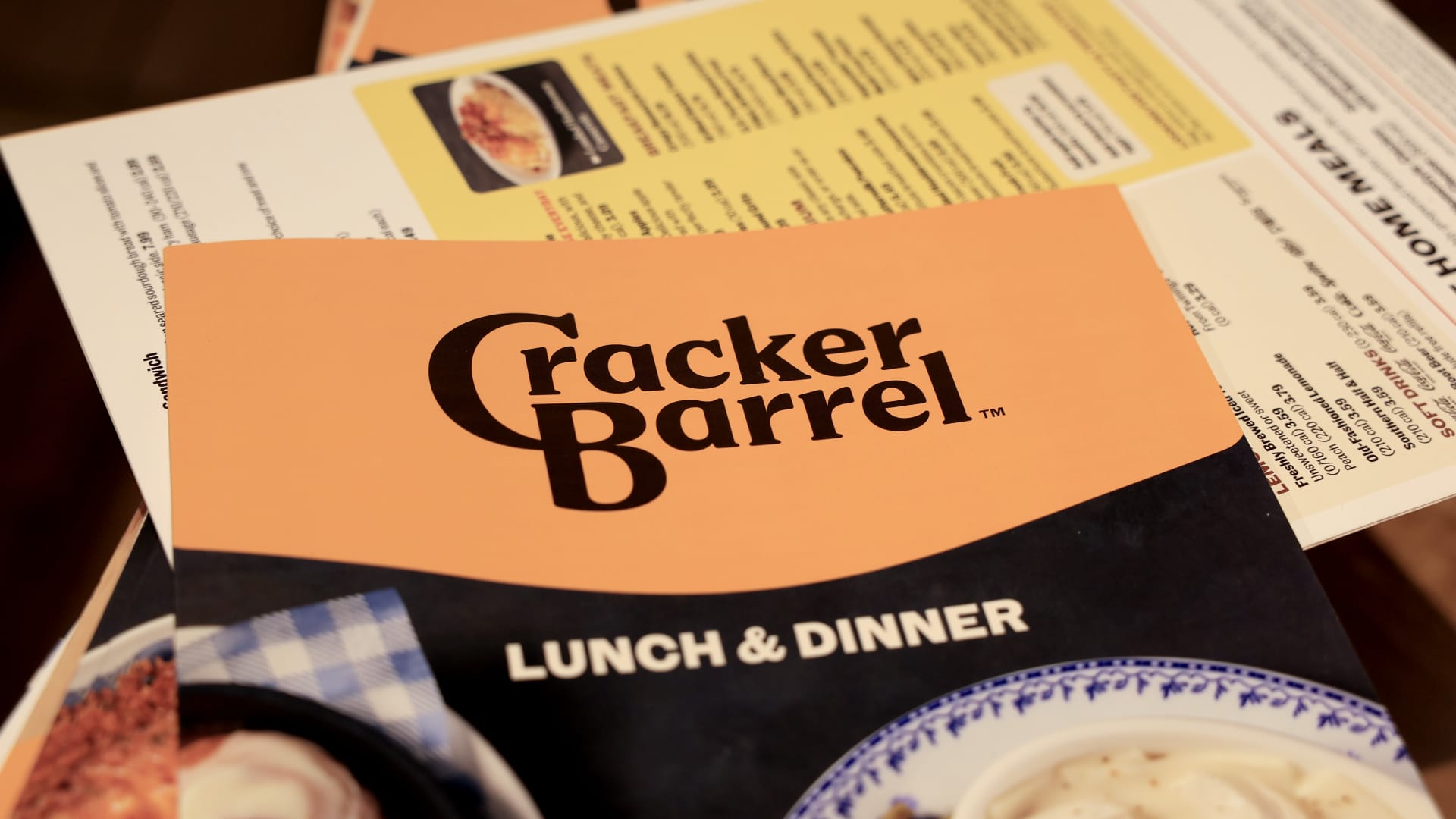
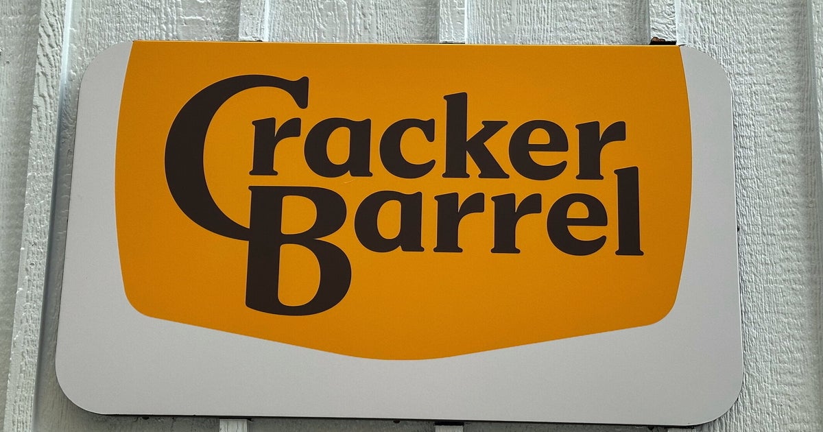
On Wednesday, the Old Country Store chain said the brand’s new logo — which simply features the text “Cracker Barrel” on top of a yellow, hexagonal-like shape — will be “rooted even more closely to the iconic barrel shape and word mark that started it all,” per a press release.
Cracker Barrel’s iconic, 1977 logo stemmed from Nashville designer Bill Holley’s drawing on a napkin and had a goal of creating “a feeling of nostalgia with an old-timer wearing overalls,” per the company.
The logo has seen minor changes in the years since but Wednesday’s redesign — which also does away with the pinto bean-shaped backdrop, a nod to one of Cracker Barrel’s original side dishes — marks its most significant makeover.
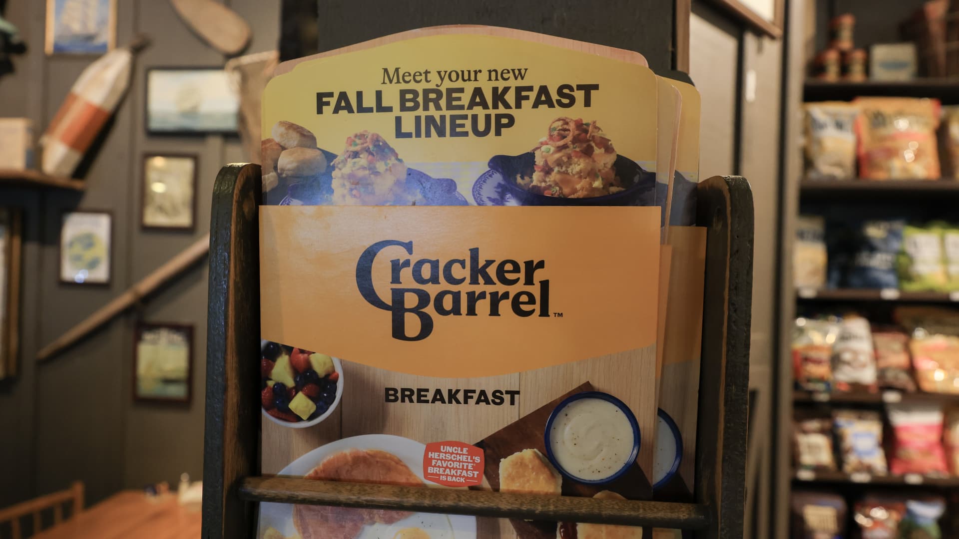
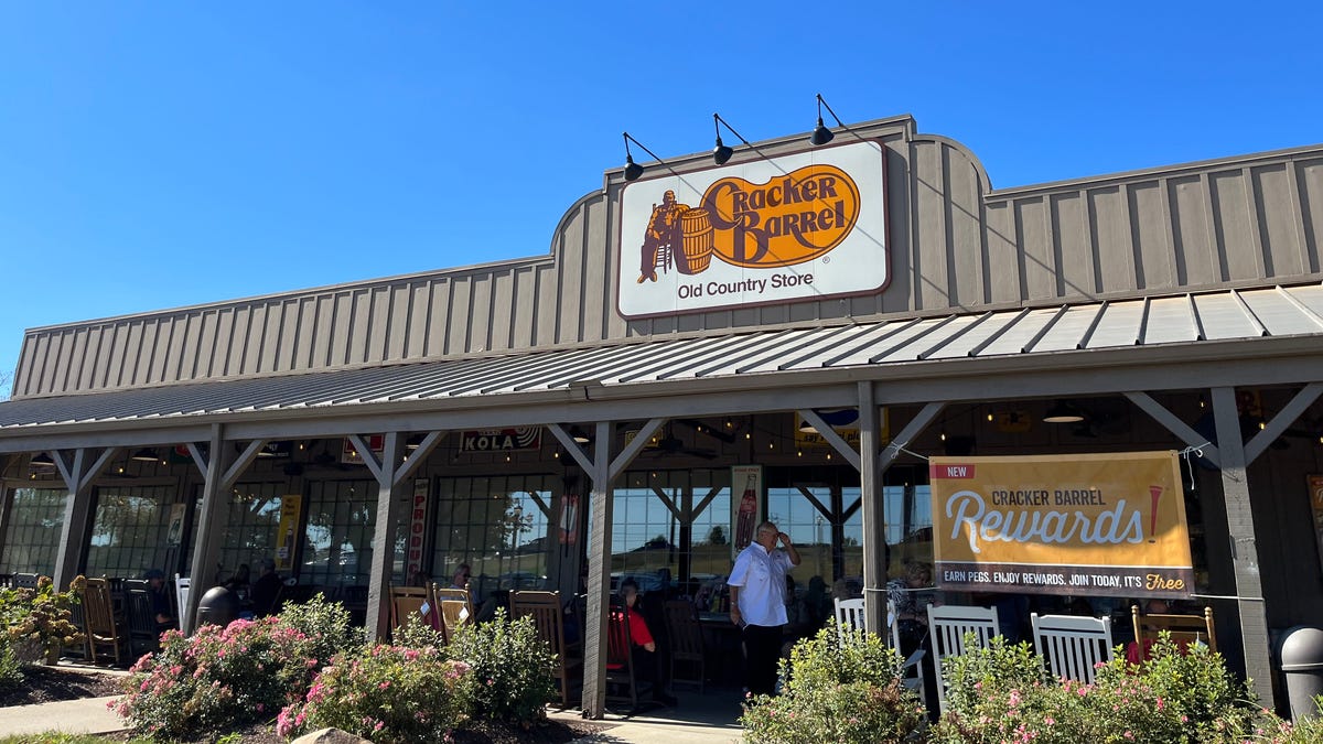
The redesign comes over a year after the chain began to remove old school decor and modernize the interiors of its restaurants in hopes of driving up sales, a move that reportedly left customers “heartbroken.”