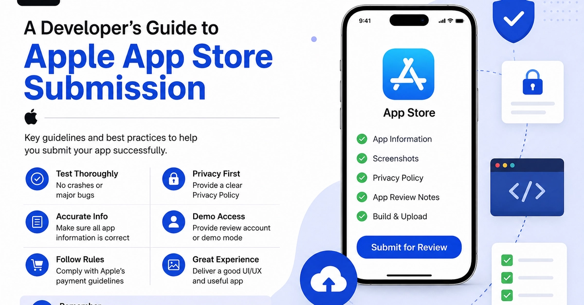
Most submission guides are engineering documents. They explain how to make the technical parts work.
Almost none treat submission as a UX problem, which it is. The reviewer is a user with a time budget. Your listing is a product page competing in a grid. The same first-impression rules that apply to onboarding apply here, and almost nobody applies them.
The reviewer is a user
A first-pass reviewer spends a short, bounded time in your app. Roughly what they encounter:
The launch screen. Is it branded, or is it a white rectangle?