I quite like how Chrome for Android’s main interface has essentially remained the same since 2012. The consistency is refreshing as everything else on my phone changes. While I’m open to modernization, the latest attempt at a redesign suffers from too much chrome.
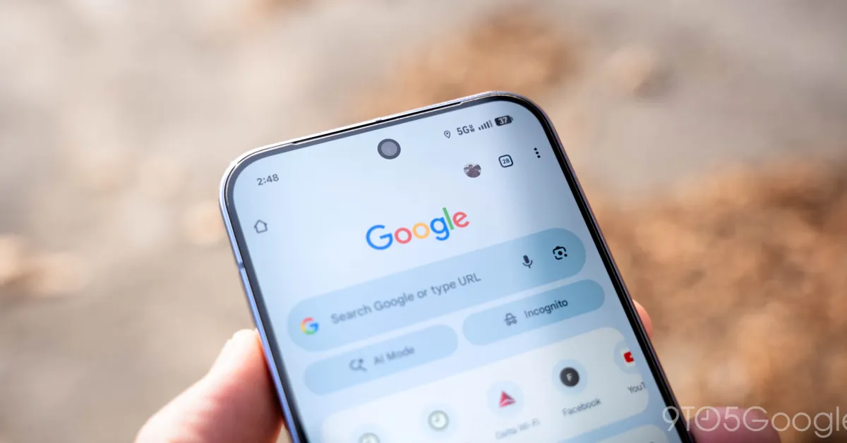
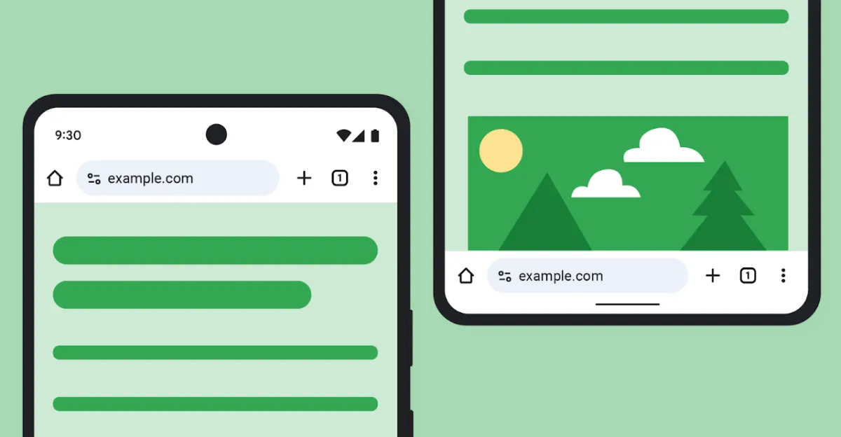
When the browser launched in 2008, the name was meant to signify speed and a minimal graphical user interface, or chrome. On Android, that philosophy has persisted with just an address bar at the top or bottom of the screen. That text field can be flanked by various buttons, but the most minimal state consists of just the tab switcher and three-dot overflow menu. Over the years, Google has just refreshed these elements while keeping the placement unchanged.
Old vs. new
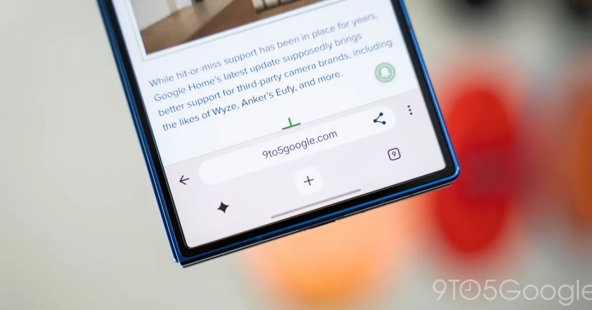
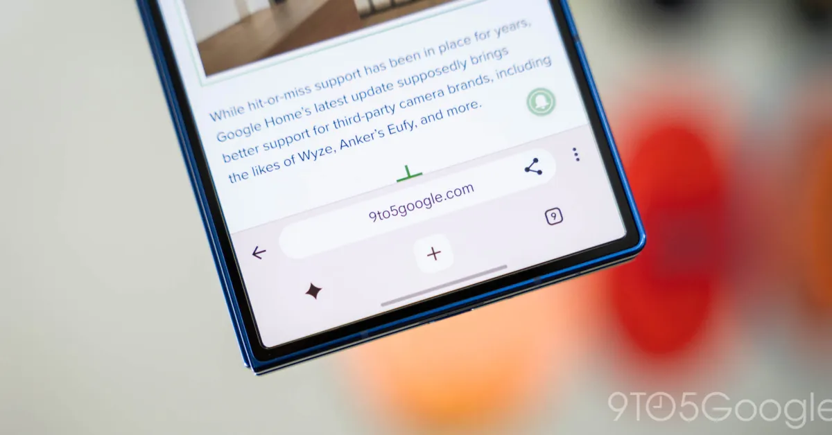
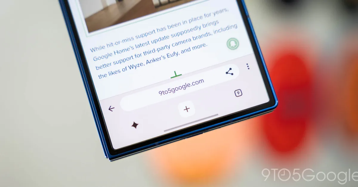
The upcoming redesign once again adds a secondary toolbar at the bottom of the screen that has buttons for your homepage (which can be disabled), Gemini, new tab, and the tab switcher. This lets Google add a dedicated back button to the left of the Omnibox, while the toolbar shortcut is now placed inside.
Google was close to launching a similar revamp in 2020, but ultimately abandoned it because “mainstream users” found it “disorienting.”