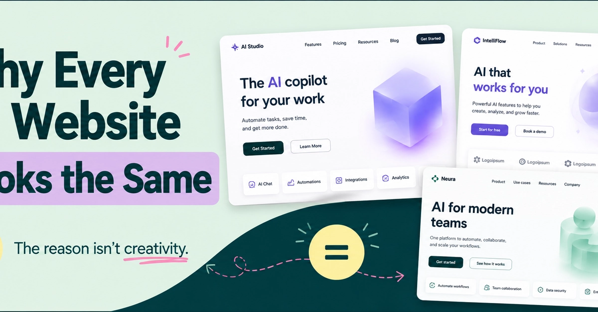
If you've built a website with AI recently, there is a good chance it looks familiar. Maybe you have seen the same oversized hero headline, the same purple-to-blue gradient, the same rounded cards, the same floating dashboard mockup, and the same neatly arranged feature sections somewhere else. You may have even generated versions of the exact same website idea with different AI website builders and noticed that the results are surprisingly similar.
So, why do AI websites look the same?
The answer has less to do with AI being incapable of creativity and more to do with the patterns these tools have learned, the components they rely on, the defaults they are designed around, and the way we prompt them.
Since we all started building with AI, almost every website seems to be following a familiar formula, and I am sure that by simply reading this article, one or two websites have already come to your mind.
You will often see a huge centered headline sitting in the middle of the screen, or to the left side of the screen with a short paragraph underneath it and a call to action button. There is probably going to be a purple-to-blue gradient glowing softly behind everything. Then come three or four rounded cards explaining the product, a row of customer logos, more whitespace, a testimonial sitting inside a soft-shadowed box, and one more call-to-action before the footer.