There's no shortage of React UI kits on npm. Search for one right now, and you'll get hundreds of results, most with the same seven button variants and a Storybook someone abandoned halfway through. So when I open-sourced brightframe — pulled out of a real coworking site I built, LAN — I didn't really want to write the usual "here's our 70 components, look how many there are" post. Component count isn't interesting. Anyone can list props and screenshot a button in five colors.
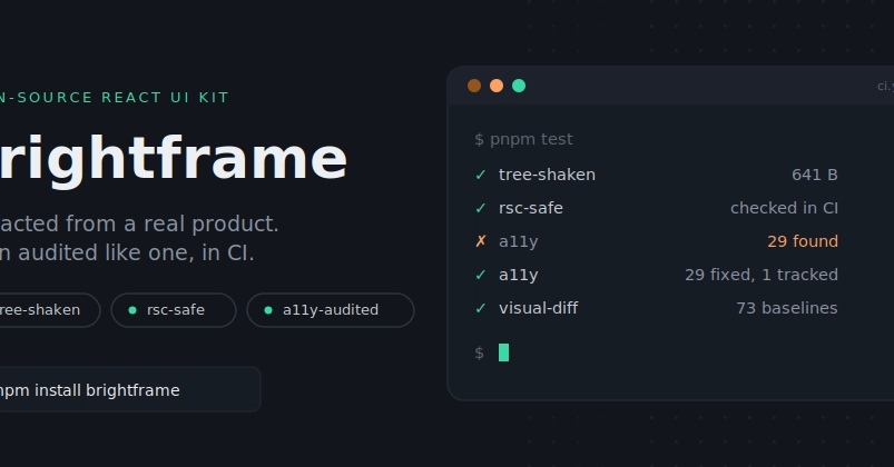
What actually took time, and what I think is worth writing about, is the part that happens after the README makes a claim. "Tree-shakeable." "Server Components-safe." "Accessible." Those are three words I typed pretty confidently early on, and then, more recently, I sat down and tried to prove myself wrong on each one. This post is what that turned up.
"Tree-shakeable per component" — okay, but how much, actually?
Every component ships as its own entry point:
import "brightframe/tokens.css";