The Quest Begins (The "Why")
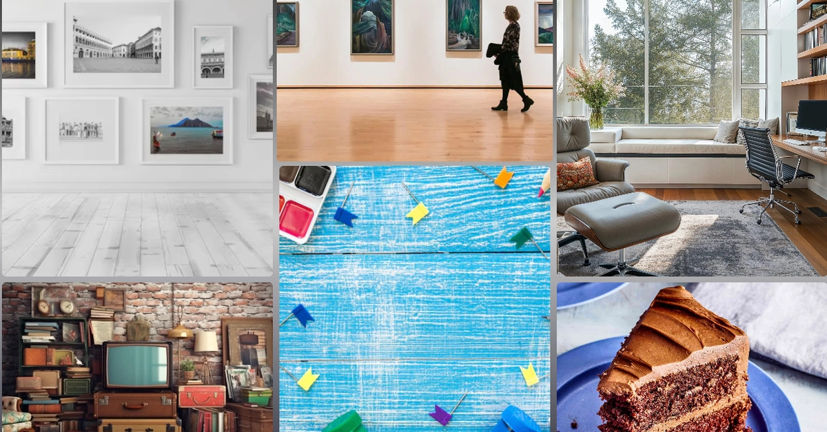
I still remember the first time I tried to build a responsive photo gallery. I had a design mockup that looked gorgeous on paper: a neat grid of cards that wrapped nicely, with a header that stayed stuck to the top and a footer that hugged the bottom. I fired up my editor, slapped display: flex on the container, and started throwing flex-wrap: wrap and justify-content: space-between at the cards like I was casting spells.
Sure, the header and footer behaved, but the cards? They started doing the Macarena—some rows had three items, others had two, and the whole thing looked like a jumbled Tetris board after a nightmare. I spent three hours tweaking flex-basis, playing with align-items, and muttering about “why isn’t this just working?” It felt like I was stuck in a boss fight where the boss kept changing its attack pattern every time I landed a hit.
That frustration was the dragon I needed to slay. I knew there had to be a better way to describe a two‑dimensional layout without turning my CSS into a tangled mess of hacks.
The Revelation (The Insight)