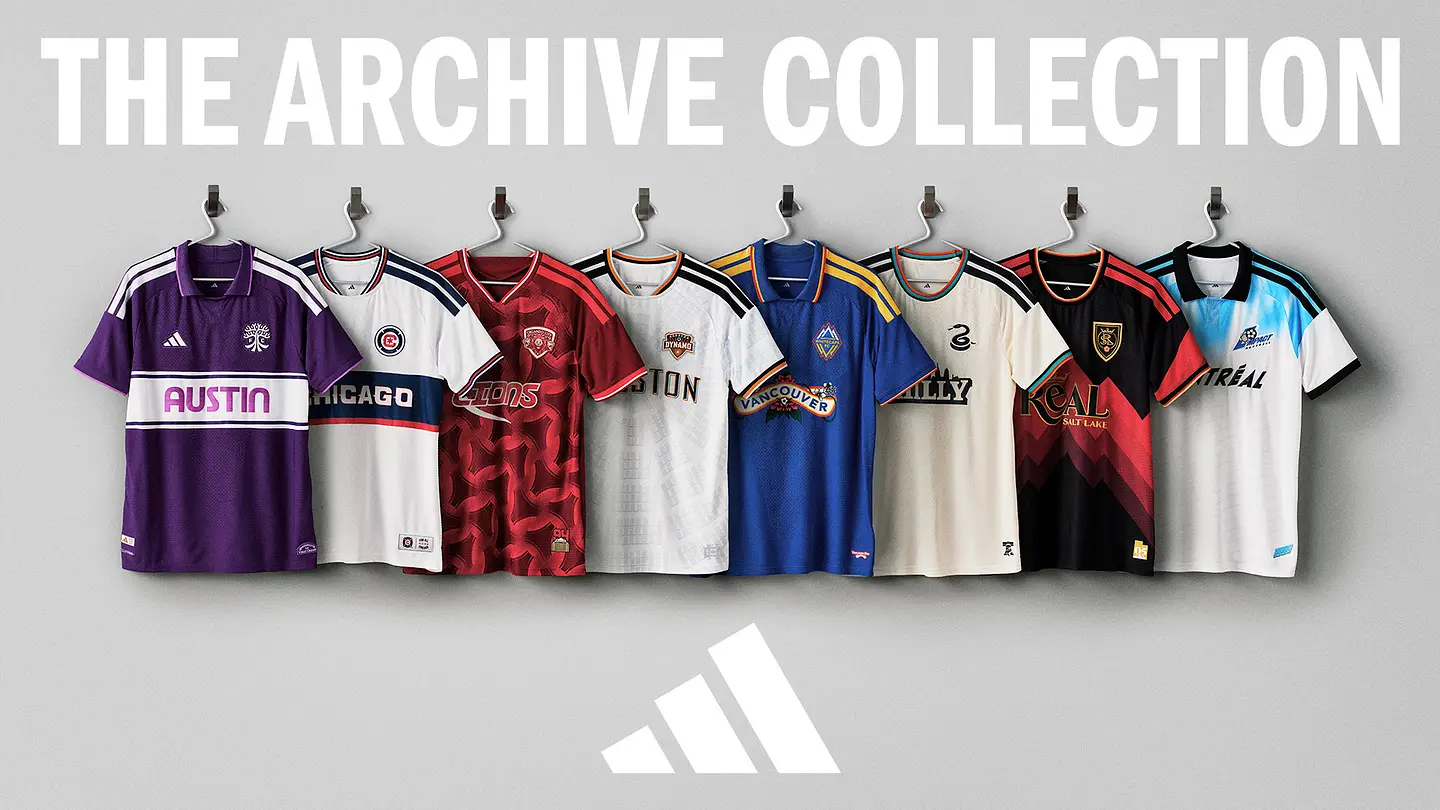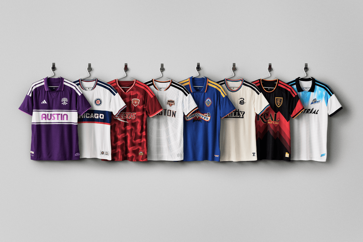
Year three of the MLS Archive Collection adds retro-inspired alternate kits for eight clubs across the league: Austin FC, CF Montreal, Chicago Fire, Houston Dynamo, Orlando City, Philadelphia Union, Real Salt Lake and Vancouver Whitecaps. These kits will be worn during the remainder of the 2026 season.“The final Archive drop is a nod to the roots of MLS culture, giving fans kits that feel nostalgic while capturing the true spirit of the eight cities that have played an important part to cultivate the fandom around soccer culture,” said Griffin Claes, Adidas’ senior designer, club and MLS. “We didn’t design these to just be third jerseys, they are pieces for fans to rep the authentic energy, landmarks and pride of their home cities whether they’re in the stands or out in their communities.”Let’s take a look at each design.Austin FC(Photo courtesy of MLS)Brooks: This one has a strong retro vibe and I like the “Austin” font. I’m not against the purple, which is meant to represent the “iconic sunset glow that’s defined the city for over a century,” according to the MLS press release. But the shorts and socks that complete this kit are the same “Violet Crown” and that’s just a lot of purple. You’re now in Grimace and Barney the Dinosaur territory with all that.Ilie Sánchez in the full Grimace. (Photo courtesy of MLS)Meg: I just Googled what an Austin sunset looks like for journalism purposes, and now I very much get the reference. To your point, Brooks, the full purple look is a lot. I wish they had leaned into a color combo a little more. Trying to use the sunset for a secondary accent color would have still been too much, but this purple with a cream/off-white to balance it out would have been elite.CF Montreal(Photo courtesy of MLS)Brooks: The Impact made their pro debut in 1993 and the vibes here are definitely of that time. I like the throwback Impact logo, but I kind of wish they took the blue tie-dye effect a little further down the shirt.Meg: Am I still annoyed over the New England Revolution getting an Archive kit last year and refusing to use their original badge (RIP “crayon flag”)? Yes. So I am mighty relieved this year to see that everyone else is totally normal about using old crests in the proper manner.What I am sort of baffled by is teams using away looks as the inspiration for these archive kits. Per the MLS release, this one “throws it back to 1993, when the Montréal Impact played their first pro game away from home.” I guess I get the first game ever appeal, but sometimes the struggle of walking the line between homage and full on retro gets exposed. The originals were way more interesting visually, with the Adidas stripes getting in the way on the Archive kit.Chicago Fire(Photo courtesy of MLS)Brooks: This is a pretty faithful reproduction of the 2000 Fire away shirt. It’s nice, but a reimagined throwback would’ve been more fun. Plus the year 2000 wasn’t that long ago and shouldn’t be considered for an Archive collection… right? Please tell me the year 2000 wasn’t that long ago.
2026 MLS Archive Collection kit reviews and rankings: Mountain tops and Grimace vibes
Our thoughts on the new batch of MLS Archive kits hitting the pitch this season.
1,338 words~6 min read