There's a rule someone dropped in a product design session that has lived rent-free in my head ever since:
"Anything digital shouldn't have more than 7 steps."
Seven. That's it. Seven steps to register, seven steps to checkout, seven steps to do the thing your app was built to do.
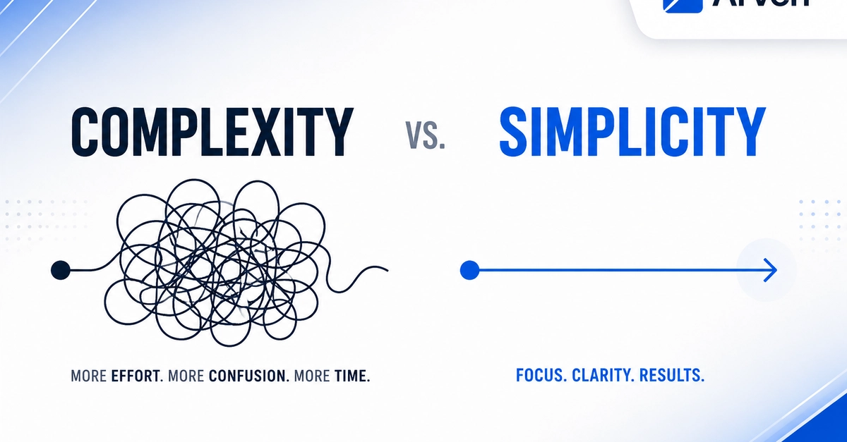
You're probably reading that and thinking: easy, we only have six steps. And then you count them. And then you remember the email verification. And the "just one more thing" screen. And the tooltip that said, "watch this quick tutorial first." And the confirmation modal. And suddenly you have fourteen steps.
This is a UX problem. This is the UX problem.