In modern UI/UX development, animations dictate how organic and responsive digital interfaces feel. Linear transitions feel static and industrial because physical objects in the real world do not instantly accelerate and decelerate at uniform speeds. Instead, high-quality, professional user interfaces rely on non-linear motion paths that simulate physical characteristics like momentum, friction, and elasticity.
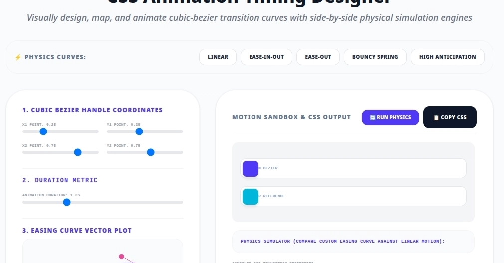
To help web developers design and visualize these parameters, we built the CSS Animation Timing Function Curve Designer on tools.kandz.me. Here is a deep dive into the math, layout challenges, and browser rendering models that power it under the hood.
1. The Mathematics of Cubic Bezier Curves
A standard CSS transition timing function uses a Cubic Bezier curve defined by four coordinate control points: the anchor start (0, 0), the anchor end (1, 1), and two independent control handles P1 (x1, y1) and P2 (x2, y2).
While the horizontal time-axis coordinates (x1 and x2) must strictly remain within the bounds of 0 and 1 to prevent temporal paradoxes (which is why our sliders enforce this range), the vertical progress-axis coordinates (y1 and y2) are unbound.