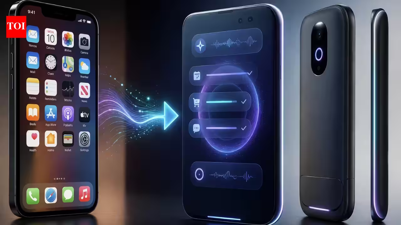
Every app you've ever shipped made the same quiet assumption: the interface is a fixed thing. You design a screen, you lay out the widgets, and every user sees the same arrangement in the same order — a 22-year-old on a commuter train at 8am and a 60-year-old at home on a Sunday get pixel-identical layouts. For thirty years that was simply what a UI was.
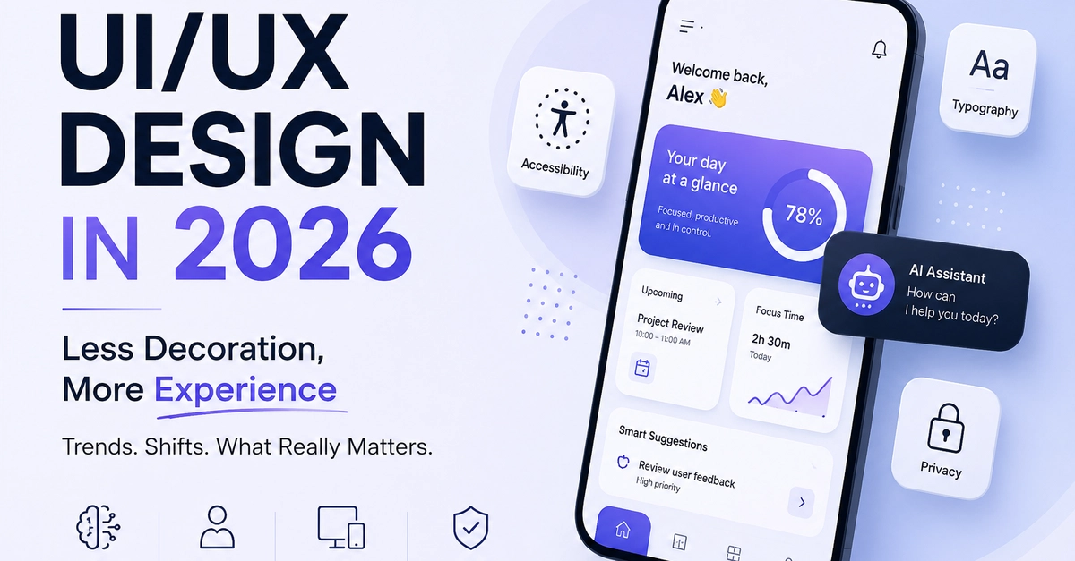
That assumption is dying. In 2026 the leading mobile apps treat the interface as a live surface that reshapes itself in real time — reordering navigation, resizing touch targets, shifting color and density, surfacing the one action you're most likely to want next — driven by on-device signals about who you are, where you are, and what you're doing right now. The static screen is becoming the exception, not the default.
Here's what's actually driving it, what it takes to build, and what it looks like in code — with Flutter examples throughout.
From static layout to living surface
The old personalization playbook was recommendation, not adaptation. Netflix reordered a content row; Spotify built you a playlist. The chrome around those recommendations — the navigation, the layout, the visual system — stayed frozen. Context-aware UX pushes personalization down into the interface itself.