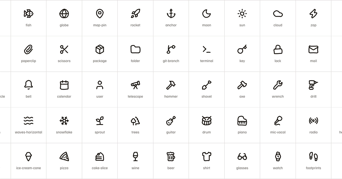
For a while my routine on side projects was this: find one sketchy icon somewhere, download the SVG, rename it, drop it in assets, then fix its stroke width because it never matched anything else I had. Next project, same thing. The hand drawn sets I could find were small and the glyph I wanted was never in them.
I did that enough times to start wondering why I was doing it by hand at all. The look comes down to a wobble in the line, and a wobble is arithmetic.
Rough.js had worked that out years ago. It draws hand drawn shapes in the browser, and reading how it does it is what stopped me treating the effect as something you need an illustrator for. Bow the straight lines a little, move the endpoints around, and an eye reads that as a hand.
The other half was already solved too. I use Lucide in everything I build. 1,756 glyphs on a 24 unit grid with a 2 pixel stroke, and somebody has already had the argument about what a "database backup" icon should look like. That argument is the hard part of building an icon set, and it was done.
So the plan was to take geometry that already works and add the hand with code.