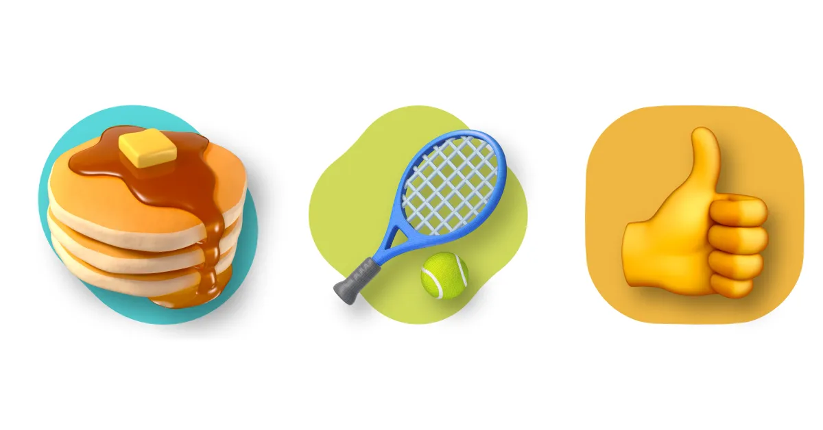
In the wake of World Emoji Day – yes, that is a thing – Google gave us some insight into why we’re switching over to the “Noto 3D” collection, but we’re wondering how people feel about the new designs.
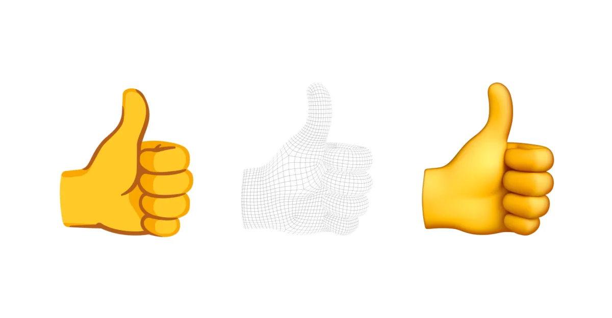
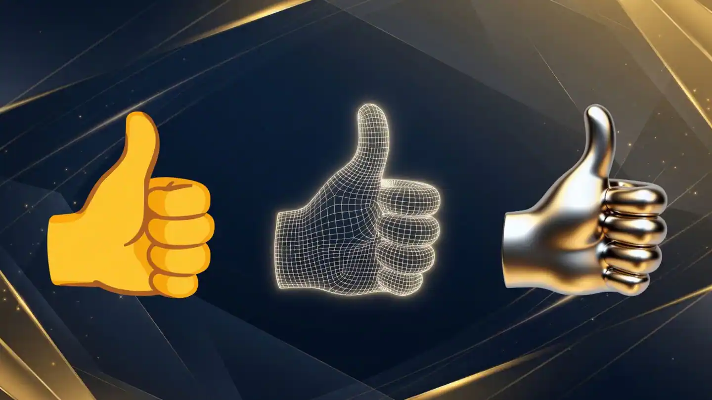
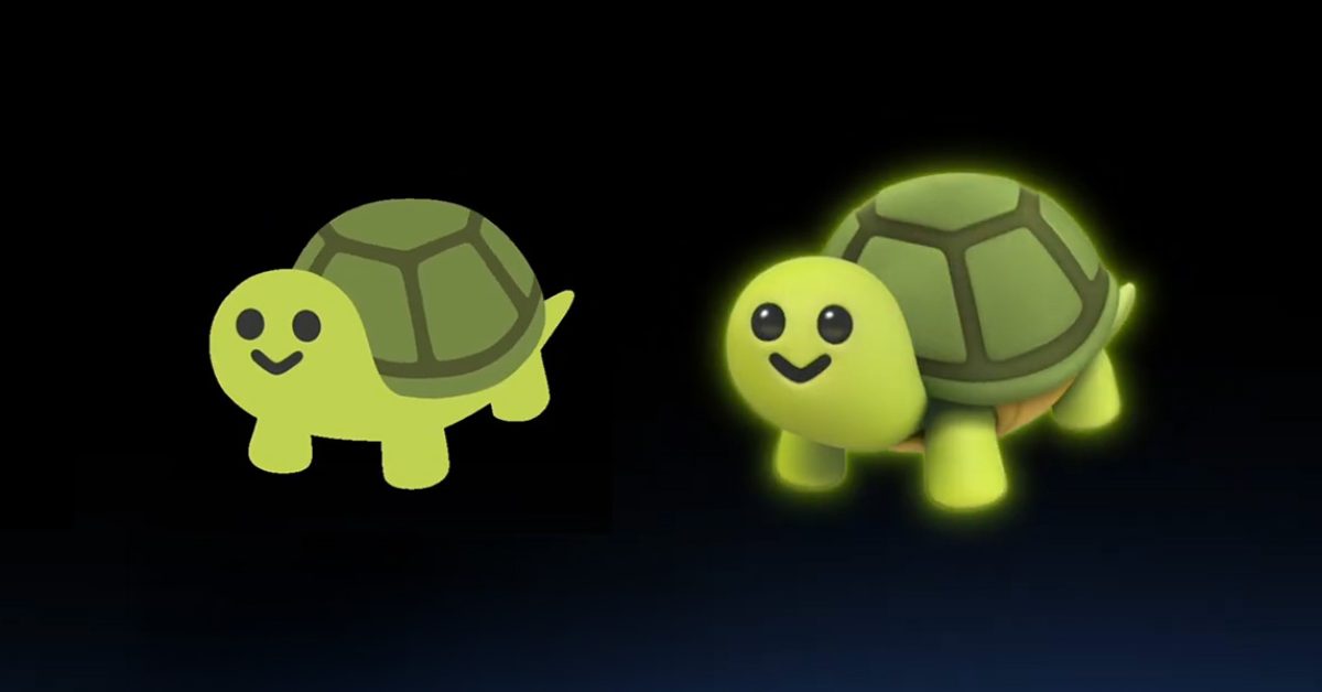
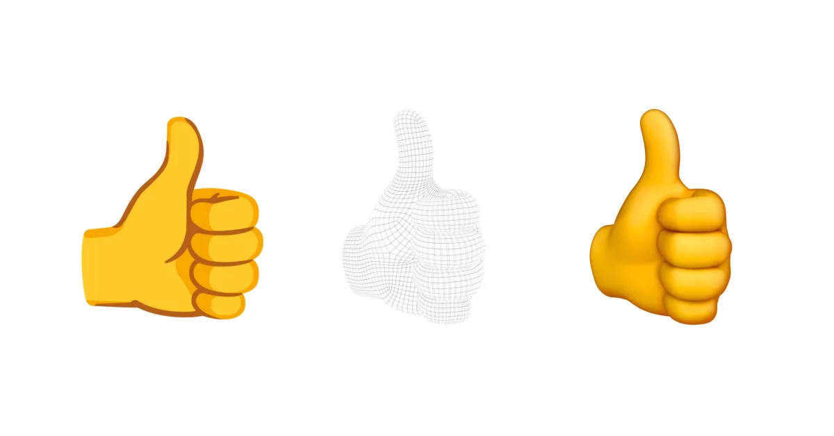
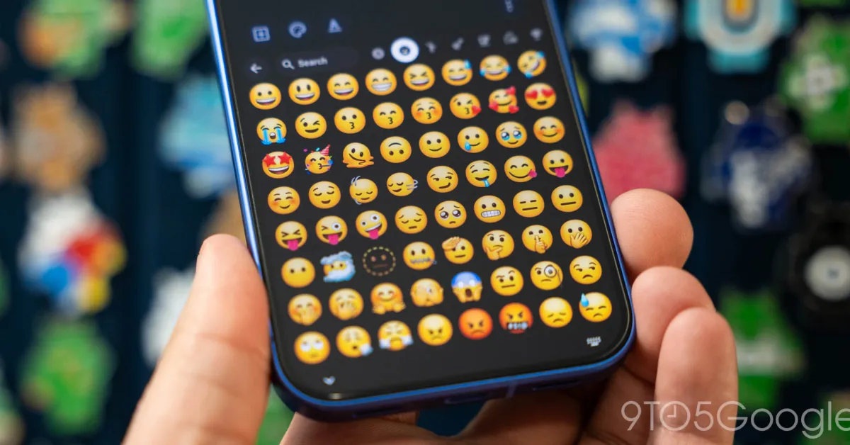
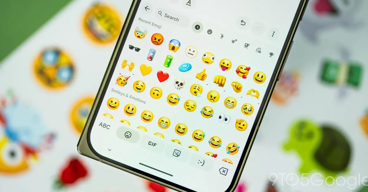
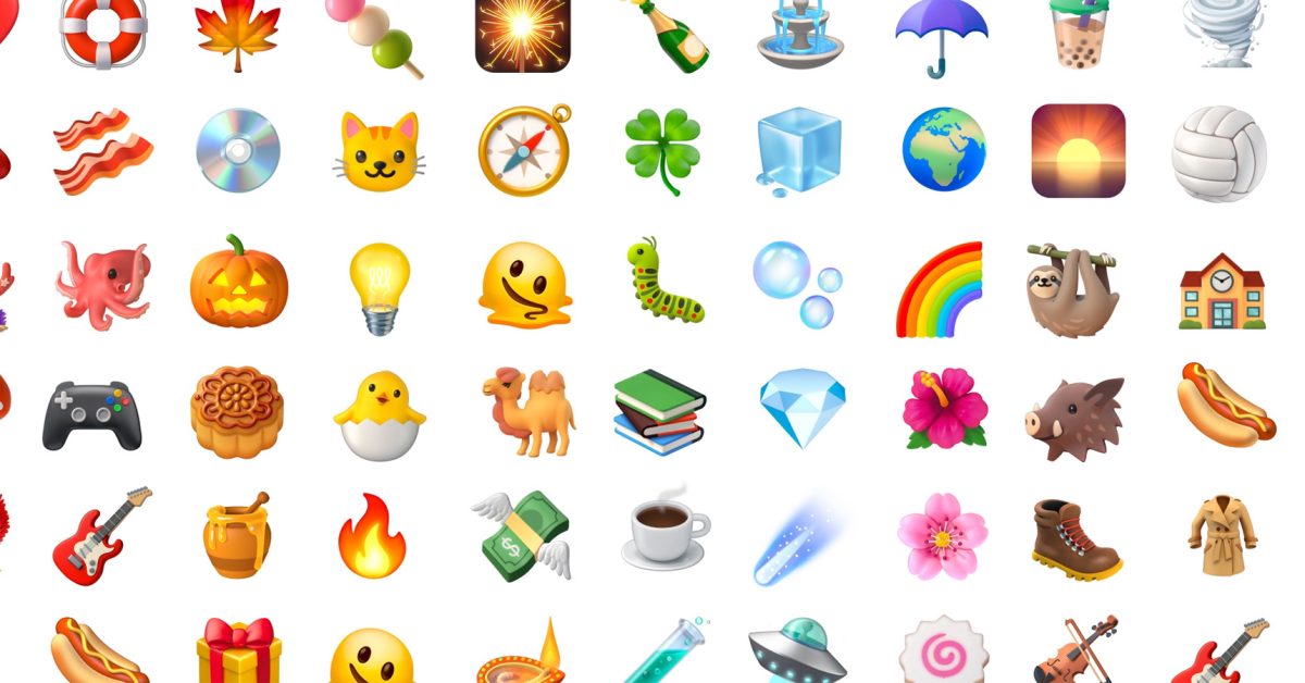
First previewed at The Android Show, the new “Noto 3D” collection completely redesigns all 3,977 characters away from the playful aesthetic that has been a signature for Google’s emoji design for the best part of 10 years.
By adding physical depth and shifting away from flat graphics, the new Google 3D emoji library ends up looking a lot less cartoonish and a lot more like the emojis found on iOS and Samsung devices. While this uniformity will undoubtedly make cross-platform communication much easier to translate from phone to phone, I think that is it comes at the cost of Google’s unique software identity. There’s a little bit of character lost in this change but some of the OG stylings are still visible.
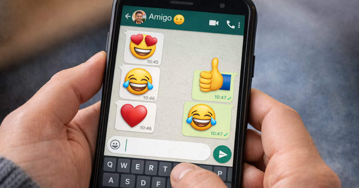
That said, you only really see the emoji when you’re using a Pixel or on other phones when using first-party apps like Gboard, Google Messages, as other platforms default to the in-app style, or in the case of WhatsApp, the iOS style is adopted even on Android. The new designs will land on Pixel phones later this year with Android 17 before rolling out across all other Google products.