A customer texted me a screenshot last month.
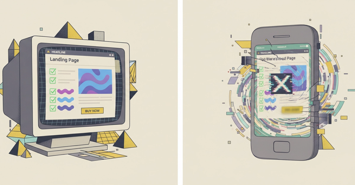
It was my own landing page, open on their Pixel. The headline — "Financial infrastructure to grow your revenue" — was clipped at "...grow your reven". The signup button below it was gray-on-slightly-lighter-gray, basically unreadable. And the hero image? A broken-image icon.
Here's the part that stung: every check I had was green. Lighthouse: 98. My Playwright tests: passing. CI: all checkmarks. I had shipped that page an hour earlier feeling good about it.
None of my tooling caught any of it. I want to walk through why, because I think a lot of us have this blind spot, and then I'll tell you what I did about it.
CI tests the DOM. It does not test what a human sees.