I’ve been thinking about this lately: media queries handle page-level layout changes fine, but they fall apart when the same component needs to behave differently depending on where it sits in the DOM.
That’s where container queries change the equation.
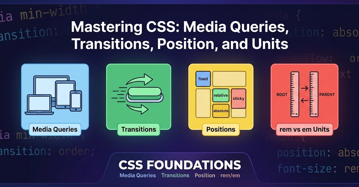
Media queries respond to the viewport. Container queries respond to the component’s container size. This matters for reusable design systems: a card component might sit in a 200px sidebar in one place and an 800px grid in another. With media queries alone, you’d need extra classes, wrapper changes, or JavaScript to handle that. Container queries let the component adapt based on its own context.
The practical rule I use: keep media queries for the page shell and major layout tiers. Use container queries inside reusable components that appear in multiple contexts. This keeps the CSS predictable without duplicating component variants.
A few real-world constraints worth knowing: