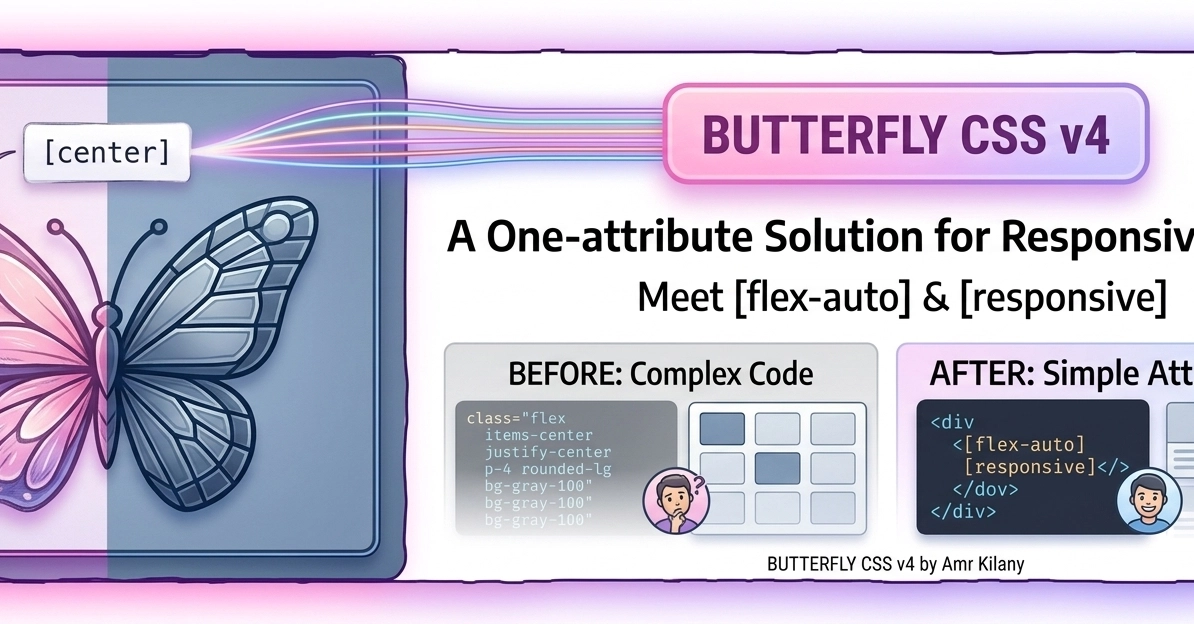
Are you sick of "Class Soup"? Does your HTML look like a war zone of 18,000+ classes? Are you tired of rigid, boring grids that break the second you add one more div?
It’s time to DITCH THE SOUP. Welcome to the Hand-Drawn Era.
Forget writing manual flex-box rules or media queries for every single child. Whether you have 5 divs or 1,555, the responsive attribute is your new best friend. It handles the structural chaos so you don’t have to.
The Old Way (The Nightmare):
<div class="grid grid-cols-1 sm:grid-cols-2 md:grid-cols-3 lg:grid-cols-4 gap-4 p-4 m-auto...">