Spend a few hours in Claude Code and the screen is mostly English — tool output, reasoning traces, permission prompts asking you to read and decide. Syntax highlighting is almost irrelevant. What matters is whether body-size prose stays comfortable after six hours of sessions.
Most terminal themes weren't built for that. They're tuned for token-colored code, where the eye jumps between short fragments. Prose reading is different: you need higher contrast on body text, tolerably soft contrast on secondary text that doesn't compete, and accent colors that don't burn.
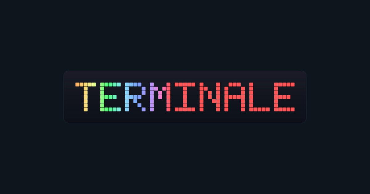
I built klein-blue around Yves Klein's IKB pigment as the anchor color — a specific blue I wanted to look at all day. There are four variations, each making a different tradeoff. Klein Void Prot is the strict one: every color role passes APCA Lc gates (body >= 90, subtle >= 75, muted >= 45, accent >= 60). The others trade some strictness for aesthetics.
One thing APCA exposed immediately: pure IKB (hex 002FA7) is effectively invisible as text on a dark ground — Lc -12. So IKB lives only in the decorative slot (ansi:blue, borders and highlights). The readable blue — permission-prompt text and similar — is a lifted Klein-family color (hex A8BEF0) in ansi:blueBright, which actually passes.