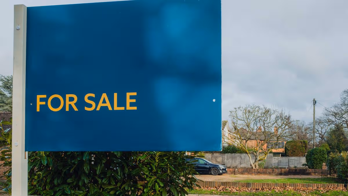
We all know the saying: ‘You never get a second chance to make a first impression.’ It’s not just job interviews or first dates it applies to – it’s just as true when it comes to house viewings.When prospective buyers come to see your place, chances are they’ve got a gut feeling before they get inside. And while there’s a multitude of ‘kerb appeal’ factors that subconsciously shape their opinion on the property – the tidiness of your front garden and the size of your driveway, for example – one of the most important, and overlooked, is the colour of your front door.According to David Turner – head of product at Leader Online, a home improvement retailer – a home’s curb appeal can have considerable implications on its value. ‘Whether it’s visitors or potential buyers, people form an opinion the moment they see a property. If that’s a positive impression, it can have real financial benefits.’So if you’re looking to shift your home, he’s shared the four shades that massively boost a place’s appeal to buyers – and the three you need to avoid, that could knock a slice off the perceived value of your home.The best colours to paint your front doorHeritage greenIf you're looking for a front door colour that's almost guaranteed to appeal to buyers, heritage green is hard to beat. Traditional without feeling old-fashioned, it's one of those shades that makes a property look classier, and thus pricier.As Turner explains, ‘Heritage green is a timeless colour that complements nature and foliage around your property. This deeper tone can look more expensive too, and can add some much-needed charm to your home, especially if it’s a newer property that lacks character.’Part of its appeal is that it has that classic, British heritage vibe. Whether it's on a Victorian terrace, a country cottage or a newer-build property, the colour blends seamlessly into its surroundings and gives the impression of a home that's been cared for and maintained. It's also far less ‘trend dependent’ than brighter colours, which can quickly date.Natural woodFew things make a home feel more warm and welcoming than a natural wood front door. While painted doors come and go with trends, timber has a timeless quality that never falls out of favour with buyers.‘Whether it’s oak or pine, the natural grain of the wood is often stunning,’ says Turner. ‘Each grain pattern is unique, and it adds a lot of visual interest and texture to your property. It’s great for warming up a cold exterior, too.’Using real wood can also help soften the appearance of brick or modern cladding on newer properties. For buyers, it gives the impression of a home that's been cared for and invested in, rather than one that's simply been given a quick spruce up before going on the market.Warm neutralIf you’re umming and ahhing, a warm neutral is the safest choice of all. While bright white screams doctor’s surgery, softer shades with warmer undertones tend to make a property feel cleaner and more inviting.‘Softer, gentler versions of neutral can be a great alternative to cool white,’ Turner explains. ‘Specifically, a warm white with pink undertones is almost universally complementary without actually looking pink. It’s hard to devalue your property or turn off buyers with a truly neutral tone.’Warm neutrals are also universal in that they work with almost every style of property, from period homes to new builds. They also give that ‘blank canvas’ vibe that property show hosts always talk up, letting a buyer imagine their own taste and personality in a home, one of the key elements of a buyable property.Muted blueColour theory – or the idea that certain colours stimulate certain moods – might sound woo. But there’s actually been plenty of studies to back it up, and these tend to find one of the most ‘positive’ colours is blue.According to various studies, blue is associated with trust, calmness and reliability – all qualities that buyers subconsciously respond to when viewing a house. But according to Turner, the key is choosing the right shade.‘Like green, a deeper, muted version of blue looks grown up and classic, unlike the garish finish of a bright, primary-toned blue,’ he says. ‘It oozes sophistication and looks like a well-thought-out design choice that a professional would make.’Think navy, slate or dusty blue rather than anything too bright. These shades look sophisticated and work particularly well with brickwork, stone and traditional architectural features, helping create the kind of polished first impression that sets a good tone for the rest of the viewing.The front door colours to avoidOverly bright coloursWhen it comes to selling your house, it’s probably not the time to ‘express your individuality’ through a tangerine-orange front door. While bold colours can look striking on Instagram or in carefully curated neighbourhoods, Turner says they can be a gamble when you're trying to appeal to the broadest possible pool of buyers.‘True oranges, blues, greens and the like are hard to pull off,’ he explains. ‘They’re harsh colours that can easily clash with the rest of your external features and are unlikely to suit most people’s taste if you’re looking to sell.’The problem is that buyers immediately start mentally adding jobs to their to-do list. If the first thing they see is a front door they'll want to repaint, their mind goes to the price and inconvenience. As Turner points out, ‘Changing or repainting the door is a cost the buyer will need to factor in, which ultimately doesn’t work in your favour.’BrownNatural wood might be timeless, but that's very different from a painted brown front door. According to Turner, brown is one of the trickiest colours to get right because it can very quickly tip from sophisticated to tired-looking.‘Natural wood is classic, but painted brown doors can easily fall into murky territory,’ he says. ‘Choosing the right brown is essential to avoid a muddy, dull effect that looks dated. It’s much safer to go with wood.’The issue is that darker browns can sometimes make a property feel older and less well-maintained than it actually is. Rather than adding warmth, they just look drab, particularly on homes that don't receive a huge amount of natural light. If you're looking for a classic look, natural timber is usually the safer bet.Bright redRed front doors have long been associated with luck and prosperity in some cultures, but not all reds are created equal. While deeper, richer shades can look elegant, Turner warns that bright, primary reds can sometimes create a harsh first impression.‘An emergency-toned red can be quite an alarming colour that doesn’t always communicate the right message,’ he explains. ‘However, a more grown-up, muted version of red, like crimson, can be an effective colour. It’s largely about getting the right tone.’Think less postbox and more Farrow & Ball burnt crimson. The problem with bright reds is that they tend to dominate the exterior of a property rather than complement it, drawing attention for the wrong reasons. When buyers are viewing dozens of homes, you want your front door to feel welcoming – not like the entrance to a post office.
Want to sell your home? The four front door colours that buyers love
We all know the saying: 'You never get a second chance to make a first impression.' It's not just job interviews or first dates it applies to - it's just as true when it comes to house viewings.
1,185 words~5 min read