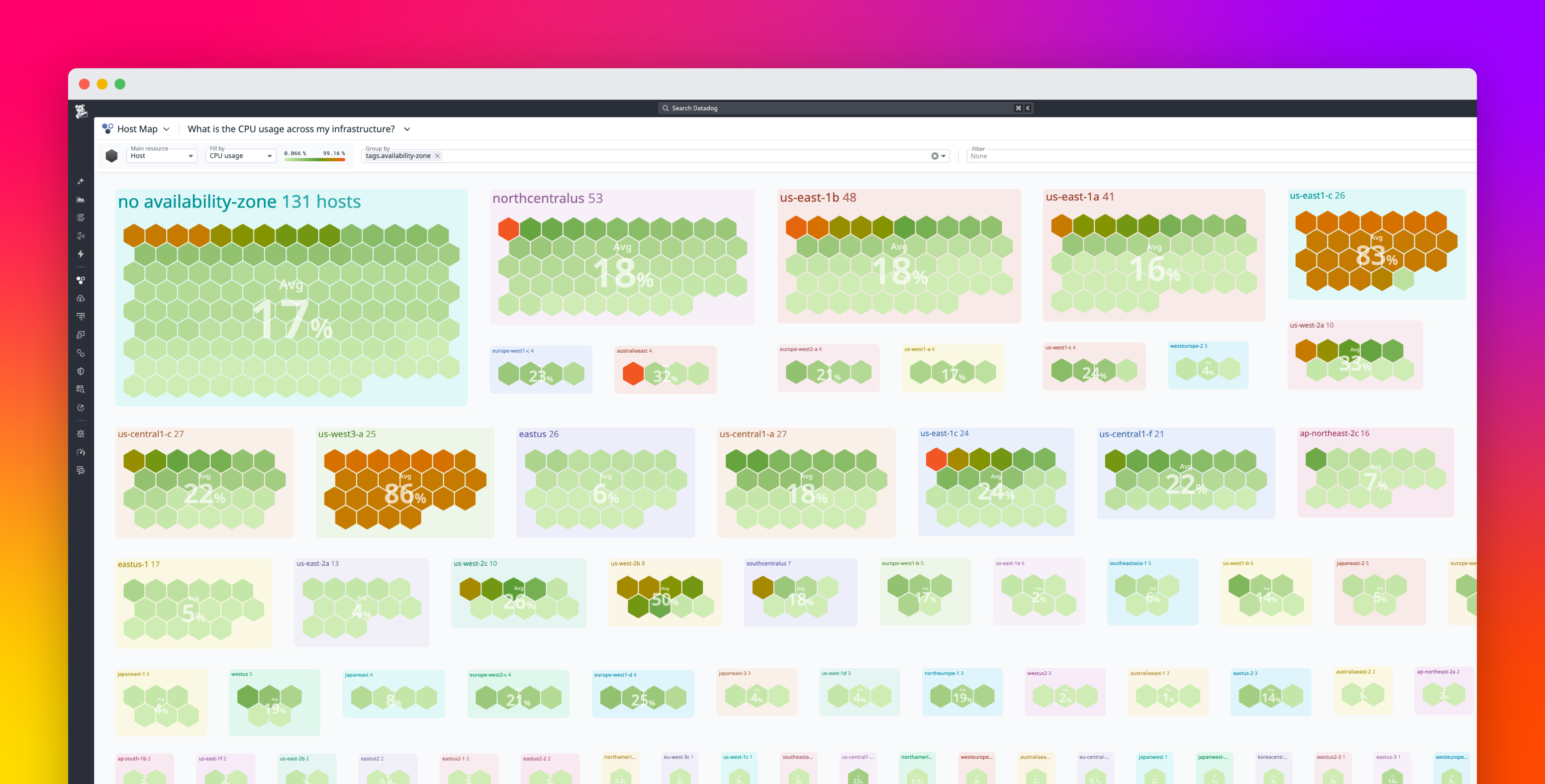
A host map is a visual representation of your infrastructure that displays hosts and related resources such as clusters, pods, and containers in a single, interactive view. We introduced the Datadog Host Map more than a decade ago to help you “know thy infrastructure” and answer critical questions: Does everything look healthy? Has anything changed? Does the shape of my environment match what I expect?
As modern systems have shifted toward Kubernetes, clusters, pods, and containerized workloads, infrastructure topology has become more layered and dynamic. We are excited to announce a redesigned Host Map that supports modern topologies by bringing hosts, clusters, pods, and containers together in a single, real-time view. With improved search, hierarchical relationships, and richer context, it helps you quickly move from high-level awareness to focused investigation.
In this post, we’ll explore how the new Host Map helps you:
Get a real-time, high-level view of your infrastructureSee how hosts, clusters, and pods fit togetherMonitor rollouts and migrations in real timeFind what you need faster with advanced search
Get a real-time, high-level view of your infrastructure