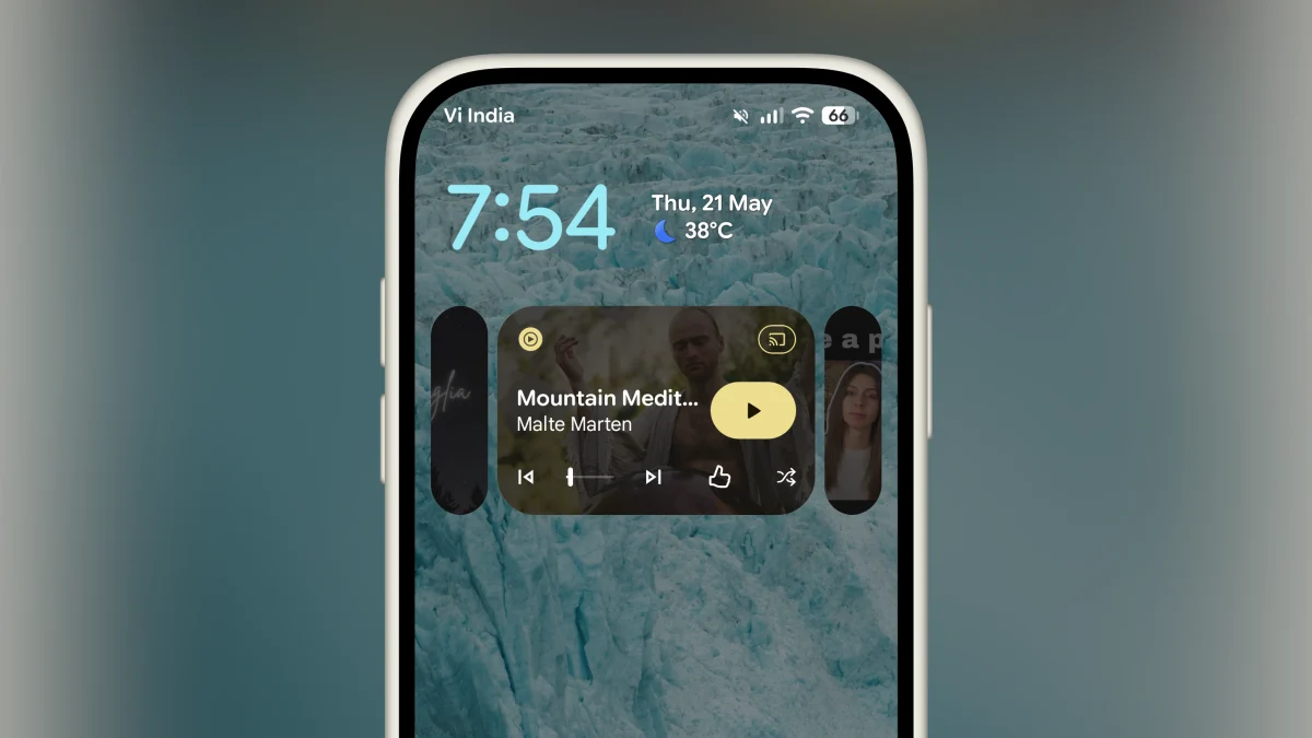
There are few elements more essential within Android than the humble media player, and every few years, Google sees it fit to deliver a new coat of paint. This year, Android 17 QPR1’s media controls aren’t getting an all-new coat of paint, but the ability to switch between multiple media apps has been completely reworked — for better or for worse.
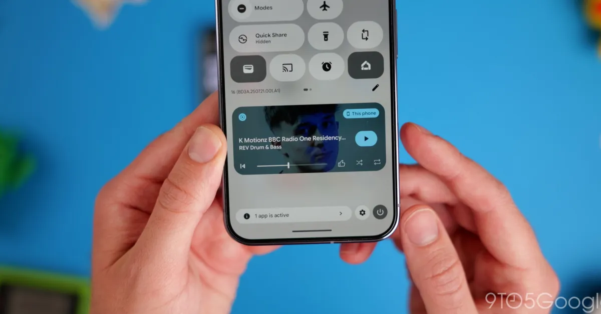
In the newly-released Android 17 QPR1 Beta 3, Google has rolled out a new Material 3-adjacent look for the media player controls on your lock screen and notification tray. While the controls themselves now remain the same, swapping between two or more recent media apps in this tray no longer requires tapping back and forth on miniscule left and right buttons. Instead, Android now shrinks the inactive cards to the left or right of the active media player.
I have to say, I’m pretty mixed on this new look. It undoubtedly looks best with three cards, where the option to swap between active and inactive cards looks much more purposeful. In comparison, the version with just two cards available ends up leaving the pill-shaped wedge looking like a visual bug more than an alternate media app.
That said, even the triple-card layout looks odd to my eye, needlessly condensing Google’s already-miniscule playback controls into a smaller space. The previous navigational arrows employed by Android on Pixel never quite felt like a native part of the player, but this style takes away from the actual functionality that this media player is supposed to bring. At the very least, giving users the option to feature larger buttons would help make up for the minimized layout — there’s plenty of wasted space to make the most of.