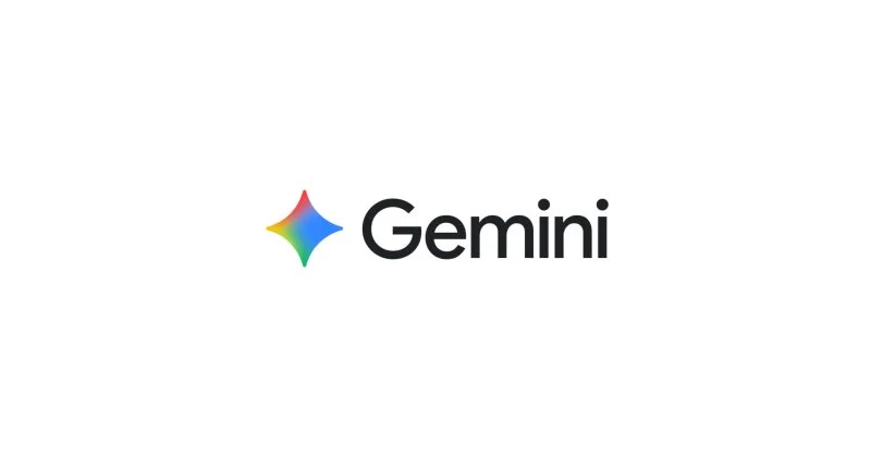
As we head into I/O 2026, Google is tweaking the Gemini app icon to be a touch more colorful.
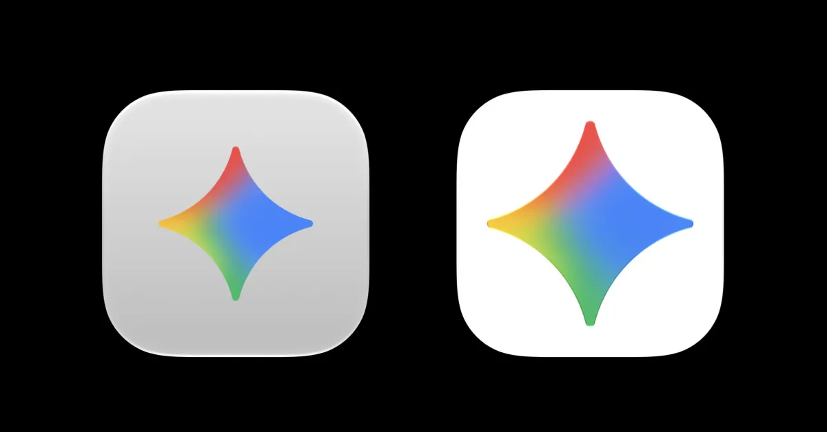
There are no changes to the shape of the spark — as it’s officially called — but it is slightly larger than before. Since the redesign last July, blue has been the dominant color.
With today’s tweak, blue has shrunk a bit from the top, left, and bottom quadrants to make way for more red, yellow, and green.
Old vs. new
Additionally, those colors are much more vibrant and solid with less of a gradient.