Take a peek in Android’s settings menu, and no matter what smartphone you have, you’ll probably find Google’s Digital Wellbeing suite hanging around. At first glance, Digital Wellbeing is perfectly modern, sporting an updated Material 3-friendly design and a whole slate of features like app timers, Bedtime mode, and more. It even has its own space within the settings menu on Pixel, rather than being buried within sub-menus like other useful tools.
But at its core, Digital Wellbeing is a product designed for the decade in which it emerged. The causes of smartphone addiction our society faces in 2026 are not equivalent to what emerged throughout the 2010s, despite plenty of familiar players begging for your attention at all times. And at this point, it’s clear no one — not Samsung, not Apple, and most certainly not Google — is coming to offer a helping hand to those who feel overwhelmed.
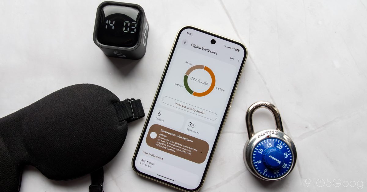
Google announced Digital Wellbeing at I/O 2018 before rolling it out later that year. Its original layout wasn’t all too different from what exists today; Google’s current UI simply has a more modern coat of paint. Even at the time, the main dashboard view delivered a pie chart layout for displaying your time with apps, the amount of unlocks on your phone, and notifications received. “Wind Down” tools like grayscale mode and nighttime Do Not Disturb automations still exist as Bedtime mode today, while various options to “reduce interruptions” still make up the rest of the list. Even its “Beta” branding still sits untouched in the corner of the app.