The push for fairer cartography rejects colonial shrinkage of a huge continent by the Mercator projection. This is not pedantry. It’s politics
T
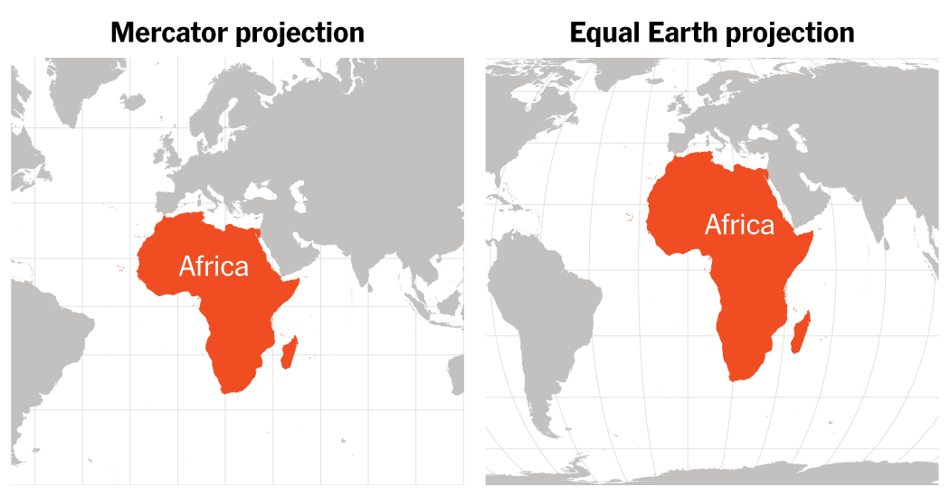
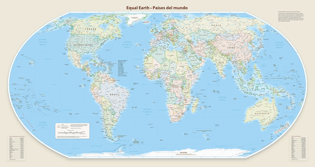
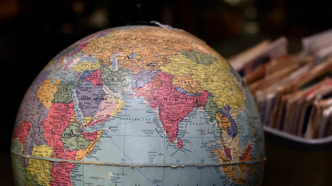
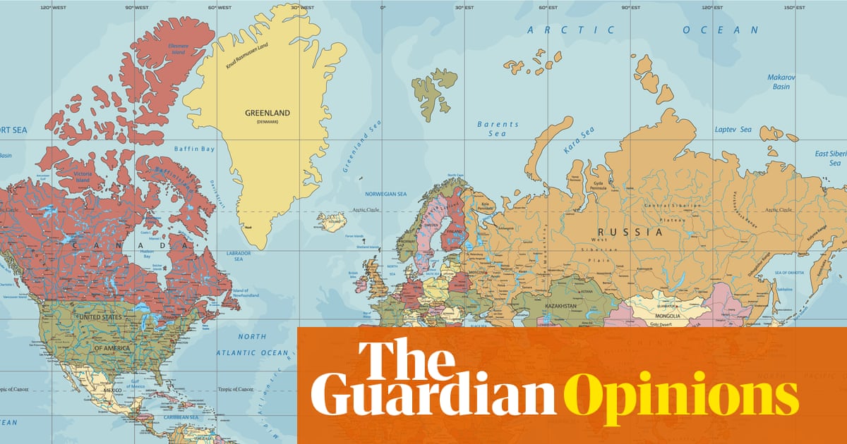
he African Union wants to replace the world’s most popular map with one that more accurately represents the continent’s size. This demand may seem better suited to geography departments than heads of government. Yet in politics, symbols matter. And the Mercator projection, devised in the 16th century to help European sailors navigate their way to conquest and commerce, has quietly shaped how we see the world for centuries.
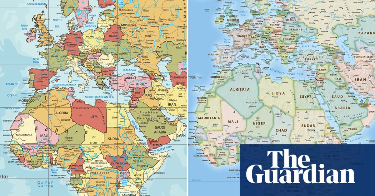
By stretching the higher latitudes and squeezing the equatorial belt, the Mercator projection distorts the relative size of continents. Europe and North America loom vast, while Africa and South America shrink. Greenland often appears roughly the same size as Africa, when in reality the continent is 14 times larger. The impression is that the north is large and central, the south peripheral and marginal.
Cartographic distortion would be forgivable if it were confined to sailing charts. But for generations of policymakers – and of children – the world has been presented through a lens that flatters the powerful and diminishes the rest. The academic Mark Monmonier, in his book Rhumb Lines and Map Wars, counters that empires were driven by politics and economics more than classroom atlases – a point echoed by critics who say Mercator has become overrated as a tool of western imperialism. It is true that colonialism didn’t need maps to justify itself, but maps helped to naturalise its worldview.